The Refugees Initiative
Design a user experience for social good
PROJECT: The Refugees Initiative
ROLE: UX, Responsive Web Design
DURATION: Feb - Mar 22
Project Goal
Design a user experience to help refugees get involved in local community service. The app's goal is to show all local community services at the destination at a glance, to make appointments, and to manage all documents.
Challenges and Target Users
Refugees have to organize many things at their place of arrival and mostly do not speak the language.
This app is for everyone who needs support at their new home.
User Research
I conducted primary research. I interviewed users, conducted surveys, and conducted a competitive audit and a usability study. My assumptions changed so that some biases could be dispelled, like, e.g., that people are afraid of accepting help from others.

Pain Points
1. Find services
For many refugees, orienting themselves at the arrival point is difficult.
2. Book appointments
Users have to book appointments for schools, doctors, or job interviews. How can we make this easy?
3. Bring required documents
Users have to bring certain documents or other things to use local services. Is it possible to improve this path?
4. Managing tasks and services
Users have to deal with many appointments, documents, and so on. How can we make management fast and easy?
Meet the users

PRIMARY
Name: Ekaterina
Age: 32
Occupation: Data Scientist
Ekaterina is a caring mother. When the war in Ukraine began, she fled Kyiv to Berlin relatively quickly. Since she doesn't know when they can return, she wants to gain a foothold in Germany. For her daughter, that also means going to school in Germany.
USER STORY
As a mother of a 11-year-old daughter
I want to find a suitable school
so that I can continue her education without interruption.

SECONDARY
Name: Dmytro
Age: 63
Occupation: Sales Manager
Dmytro lived with his wife in Kyiv until the beginning of the war. Arriving in Germany, they quickly found accommodation. Since he has a visual impairment and does not speak German, accessibility to web content is crucial. He also has to go to the pharmacy regularly to get medicine for himself and his wife.
USER STORY
As a type 2 diabetes patient
I want to find a specialist in my area
so that I can continue my treatment.

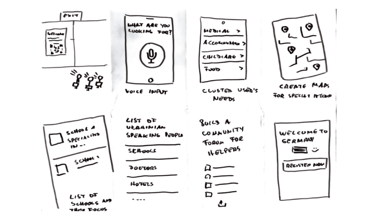
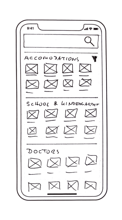
Paper Wireframes
Before moving onto high-fidelity wireframes and mocks, I wanted to get a feel for what the web app's core would look like when put in front of me.
Digital Wireframes
The user flow outlines how the user navigates from choosing a service to making an appointment and managing their benefits.
User Testing Results
ROUTE 1 - FINDINGS
1. Users had no issues finding services
2. Some users want to see filter options
3. Some users need help when they’re stuck
ROUTE 2 - FINDINGS
1. Somer users were skeptical about why they should register an account
2. Some users couldn’t read the text
3. Some users want to save their local services
Insights Priorization
Priority 0 (Essential)
1. Based on the theme that: some participants want to have filter options, an insight is: to add filter icons that open a list of options.
2. Based on the theme that: some users were stuck, an insight is: to show a help button.
3. Based on the theme that: some users had a hard time reading the text, an insight is: to increase legibility.
Priority 1
1. Based on the theme that some users want to save their local services, an insight is: creating a personal section in the app.
Priority 2
1. Based on the theme, one participant was skeptical about registering an account, an insight is to make registration optional.


From Paper to Digital
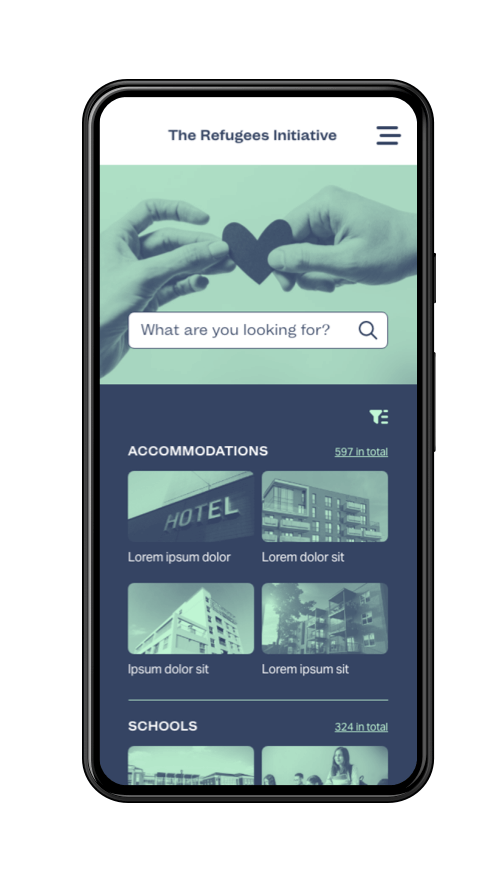
Based on the test findings, I iterated on the wireframes and created a high-fidelity prototype (see link below).
Accessibility Considerations
Color Contrast
I made sure that the contrast ratio is at least 4,5:1, which means AA status according to WCAG compliance.
Button Placement
Main CTAs are placed so that users can operate them with one hand.
Screen Reader
The app is screen reader friendly. All images and videos have captions.
Takeaways
I learned a lot, e.g., how vital research is as it builds the foundation for every decision made later in the project. I learned how biases can influence user testing and how to overcome them. I also learned how vital accessibility and inclusion are and that many apps ignore this.
Be sure to check out the process for the app’s creation below!
Studio