

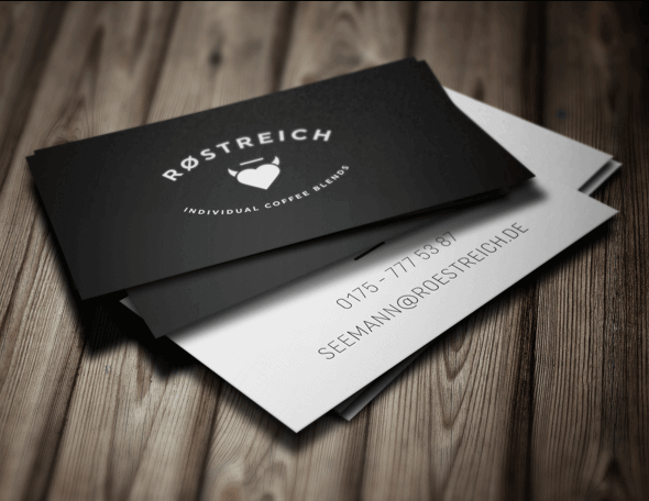
RØSTREICH founded by Kai Seemann offers individual coffee blends, that are carefully selected and roasted. The name and branding is inspired by the quote“Coffee has to be black like the devil, hot as hell, pure as an angel and sweet as love.“
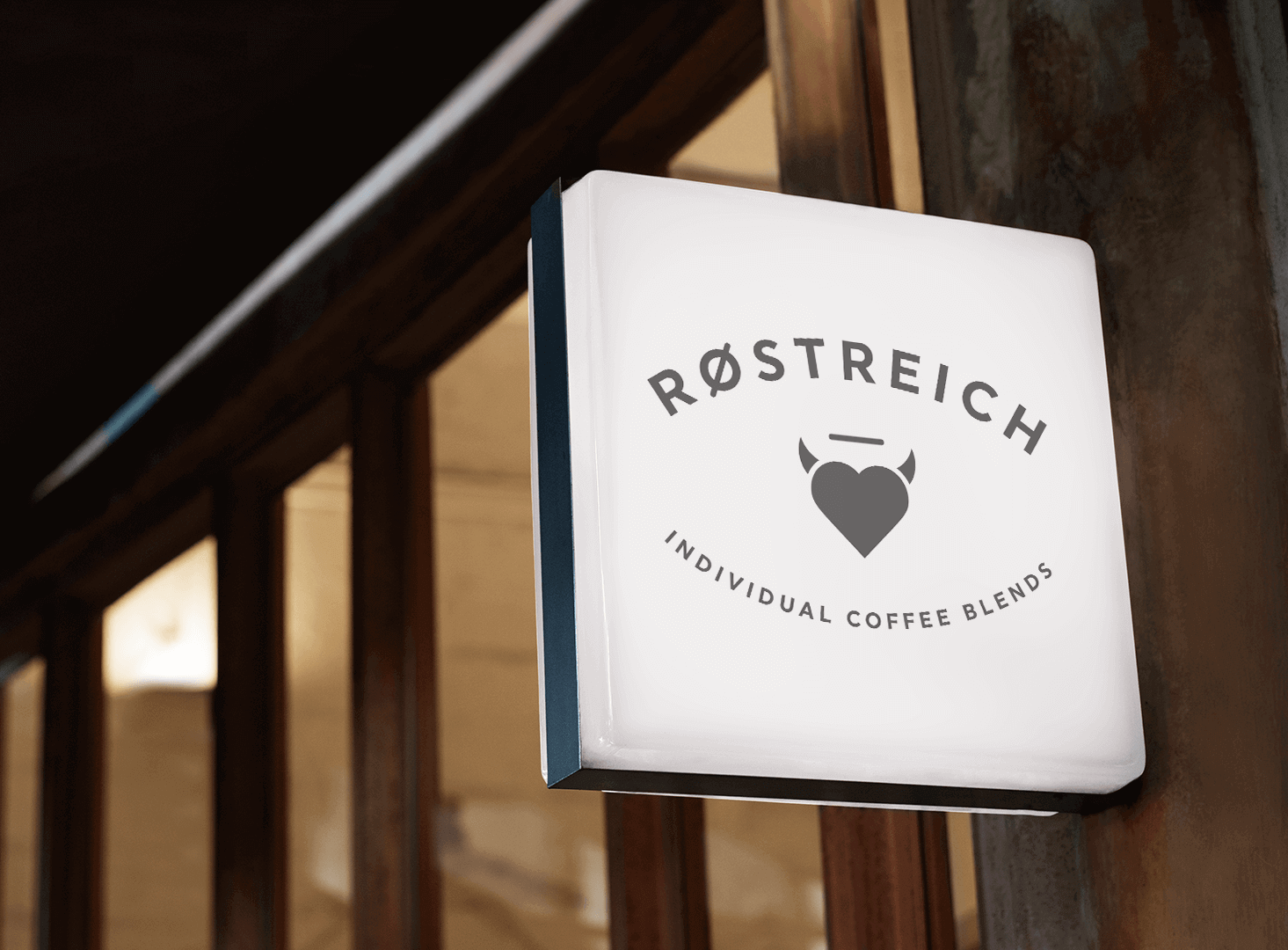
The RØSTREICH style is black and bold. Just like a good, strong espresso.
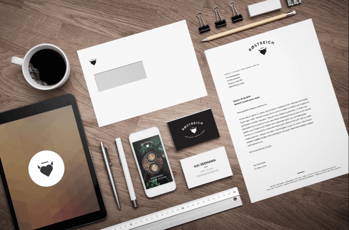
Corporate Design, Packaging Design, Web Design

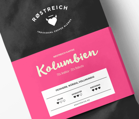
Packaging Design
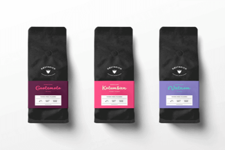
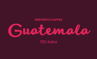
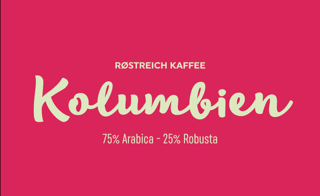
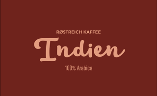
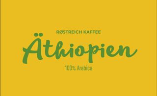
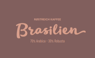
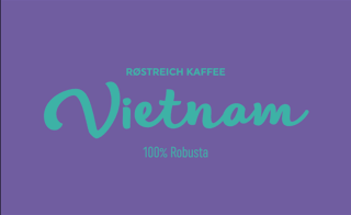
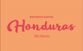
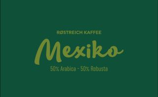
The color system of Røstreich coffee is inspired by the aroma colorwheel, where each color represents a different flavor and taste.
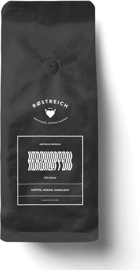
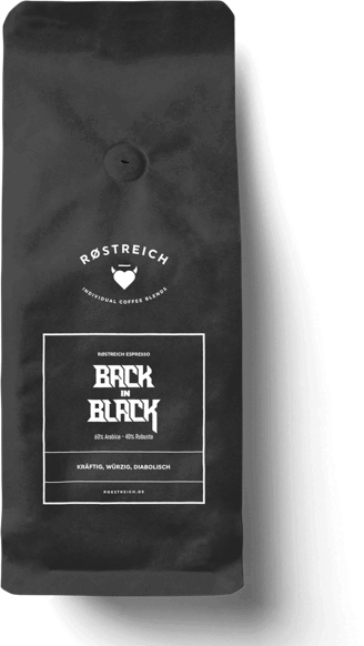
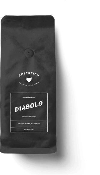
RØSTREICH Espresso
The espresso packaging stays black and white to make a bold statement.
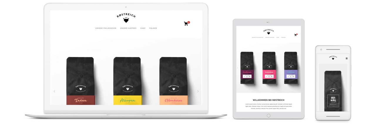
Web Shop
Jan - Feb, 2019
Art Direction, Web Design
Logo Design, Corporate Design, Packaging Design, Web Design
Studio