Sense App
Design an integration process for smart home devices
Project Goal
GROHE Sense is an app that primarily allows users to make their homes secure from water damage with smart water controllers. I’d like to understand what specific challenges our users might face and figure out how they can connect devices with just a few clicks.
Challenges and Target Users
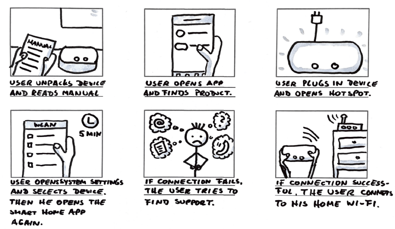
Users often fail to connect their smart water devices to their home network due to a complicated integration process.
Target users are homeowners, house managers, and plumbers.
User Research
I conducted primary research. I interviewed users, made surveys, and a competitive audit, and a usability study to understand how users are using the product to this point. My assumptions changed in a way that some biases could be dispelled, like, e.g. that older people have problems with modern technology.

Pain Points
1. Register an account
Users don’t understand why they should register for an account. How can we skip this step in the process?
2. Find a device
Users have to identify the right device by finding the serial number. How can we make this easier?
3. Connect the device
Users have to leave the app and open the system settings to select the device’s hotspot. Then they have to return to the app. Is it possible to shorten this path?
4. Connect to Wi-Fi
Users have to provide their Wi-Fi credentials in order to connect the device to the cloud. How can we make the connection fast and easy?
Meet the users

PRIMARY
Name: Joseph
Age: 55
Occupation: Sales Manager
Joseph lives in a small town with his wife and two dogs. This year he decided to modernize his house and protect it against water damage. For this purpose, he bought an intelligent water controller, which he would like to install himself. He has some crafting skills but isn't very knowledgeable about new technologies.
USER STORY
As a homeowner with few technical skills
I want to have a clear set of instructions and guidance steps
so that I achieve device integration with the best experience possible.

SECONDARY
Name: Josh
Age: 32
Occupation: Plumber
Josh is a passionate plumber. He goes to work early and comes home in the afternoon. In his spare time, he plays online games and works with computers. He is the only one in his company familiar with innovative home products. This makes him a valuable employee for his boss.
USER STORY
As a plumber who’s working mainly on-site
I want to have a hassle-free device integration
so that I can finish installations quickly.

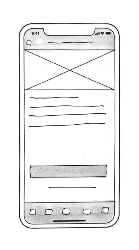
Paper Wireframes
Before moving onto high-fidelity wireframes and mocks, I wanted to get a feel for what the app's core would look like when put in front of me.
Digital Wireframes
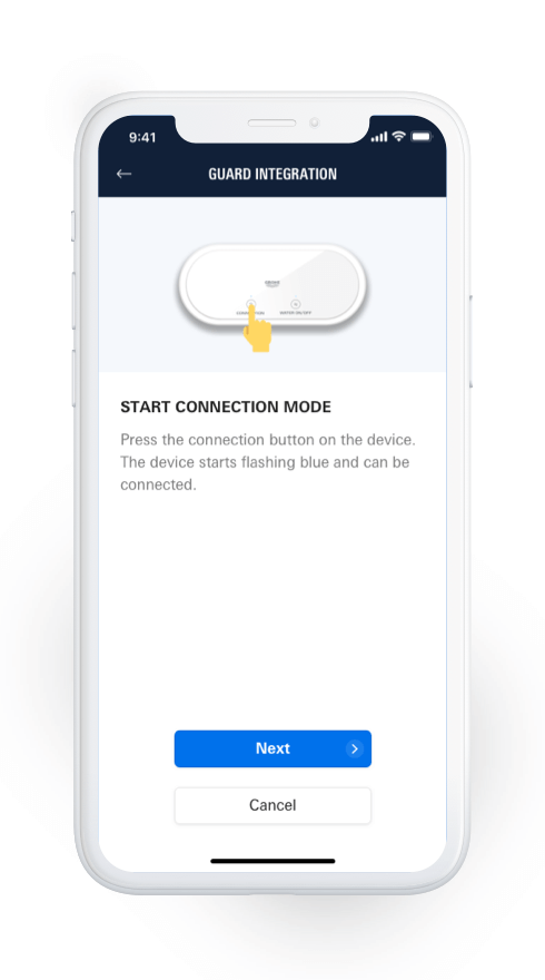
I replaced the old integration flow with the new QR code scanning function. The user flow outlines how the user navigates from choosing a device to connecting to a Wi-Fi network.
User Testing Results
ROUTE 1 - FINDINGS
1. Users had no issues finding the device
2. Some users don’t know why to name devices
3. Some users have trouble finding the QR code
ROUTE 2 - FINDINGS
1. Somer users were skeptical about whether to allow camera access
2. All users were able to scan the code
3. Some users had trouble finding their Wi-Fi credentials
Insights Priorization
Priority 0
1. Based on the theme that: some participants had trouble selecting the right product, an insight is: to add serial numbers for better reference.
2. Based on the theme that: some participants had trouble choosing a name for the device, an insight is: to mark input fields as optional.
3. Based on the theme that: one participant had concerns if scanning fails, an insight is: to create an alternate path for connection.
4. Based on the theme that: some participants had trouble with their Wi-Fi passwords, an insight is: to add a modal to inform users that they have their Wi-Fi credentials ready before starting the integration process.
Priority 1
1. Based on the theme that: one participant needed help to open the connection mode, an insight is: to show an animation instead of a static image.
Priority 2
1. Based on the theme that: one participant needed help to open the connection mode, an insight is: to link to a FAQ page and customer support page.


From Paper to Digital
Based on the test findings, I iterated on the wireframes and created a high-fidelity prototype (see link below).
Styleguide
Utilizing a soft gradient of cool and calm colors was the perfect fit for the Sense app’s branding. The blue helps evoke a happy feeling out of users, and paired with the fuchsia, it creates a nice balance between calm and energetic. The primary typeface for the app is Linotype Univers. This is the brand’s corporate typeface. The condensed weight is solely used for numbers and data.
Accessibility Considerations
Color Contrast
I made sure that the contrast ratio is at least 4,5:1, which means AA status according to WCAG compliance.
Button Placement
Main CTAs are placed so that users can operate them with one hand.
Screen Reader
The app is screen reader-friendly. All images and videos have captions.
Takeaways
Research is crucial as it builds the foundation for every decision made later in the project. Biases can influence user testing, and you have to overcome them. Also, accessibility and inclusion are essential, and many apps ignore this.
Studio