Disfrutar
Concept for a food ordering website
PROJECT: Disfrutar Website
ROLE: UX, Responsive Web Design
DURATION: Feb - Mar 22
Project Goal
We create a website to help food lovers find a suitable dish and be transparent about the quality. We need to find out if choosing dishes and ordering is easy.
Challenges and Target Users
We want to create a best-in-town experience as positive as visiting a restaurant. Target users are all individuals with online shopping tendencies who like to browse or order food online at least once a week.
User Research
I conducted primary research. I interviewed users, conducted surveys, conducted a competitive audit, and conducted a usability study. The research goals were to determine if the website is easy to use and if users can accomplish the core tasks (find and order food).
I identified the following KPIs:
- Use of navigation vs. search
- Drop-off rates
- Conversion rates
- System usability scale
Pain Points
1. Selection of food
The offer of dishes is often overwhelming. How can we simplify this part of the process?
2. Transparency about quality
Users want to learn about the quality of the restaurant’s products.
3. Delivery time
In general, waiting times are very long, and there’s no clear communication about the delivery. How can we improve this?
4. Food details
Users want to see more details about the dishes. How can we make this easy to communicate?
Meet the users

PRIMARY
Name: Nina
Age: 44
Occupation: Art Director
Nina is a passionate graphic designer. She takes the children to school and picks them up in the afternoon after work. She likes to spend her free time with her children on the playground. She and her husband love to cook but often don't have the time. Everyone in the family has their preferences and favorite dishes, sometimes making cooking tricky.
USER STORY
As a busy mother of two kids and a food lover
I want to filter by price, waiting time, or type of cuisine
so that I can quickly order the proper meal for each family member.

SECONDARY
Name: Milad
Age: 31
Occupation: Project Manager
Milad lives with his girlfriend and their dog in Düsseldorf. He doesn’t plan meals, and sometimes his girlfriend plans dinner. Both are not very keen on cooking, but they enjoy good food. They both like to chill on their couch and order food online after work.
USER STORY
As a busy professional and food lover
I want to be offered suitable food suggestions
so that I have a good variety in my menu plan.
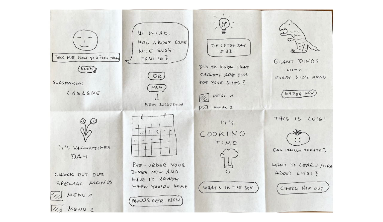
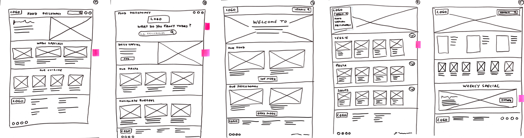
Paper Wireframes
Before moving onto high-fidelity wireframes and mocks, I wanted to get a feel for what the app's core would look like when put in front of me.
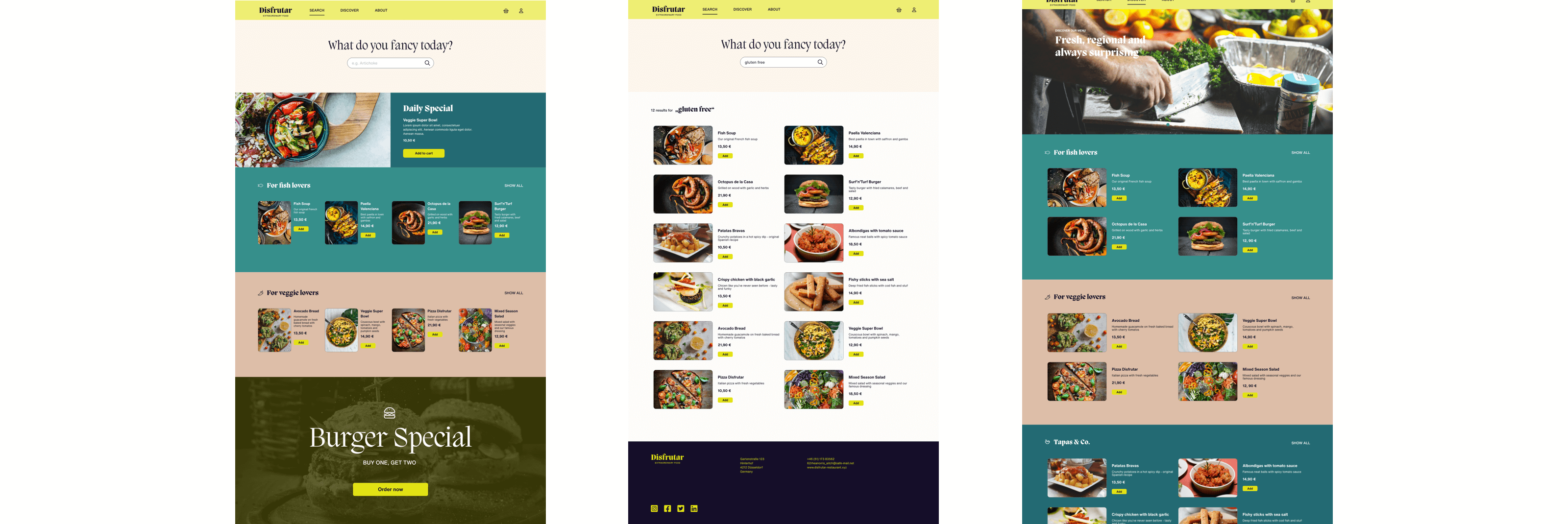
Digital Wireframes
The user flow outlines how the user navigates from choosing dishes to ordering.
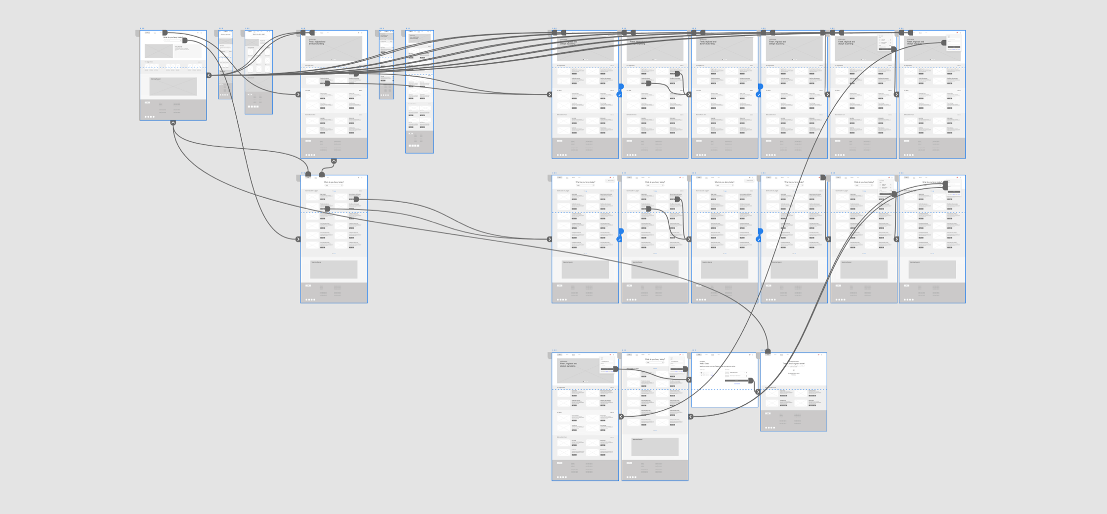
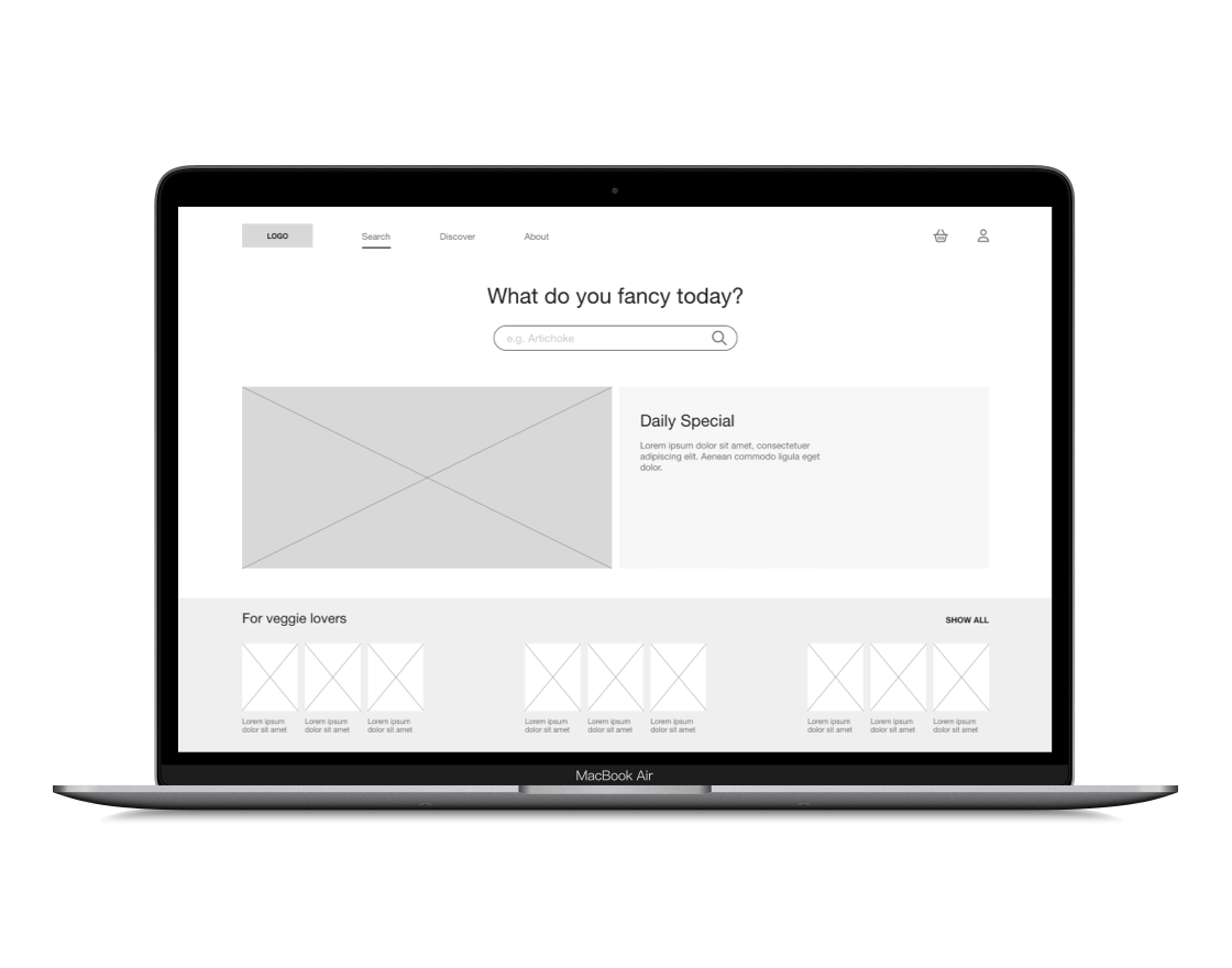
From Paper to Digital
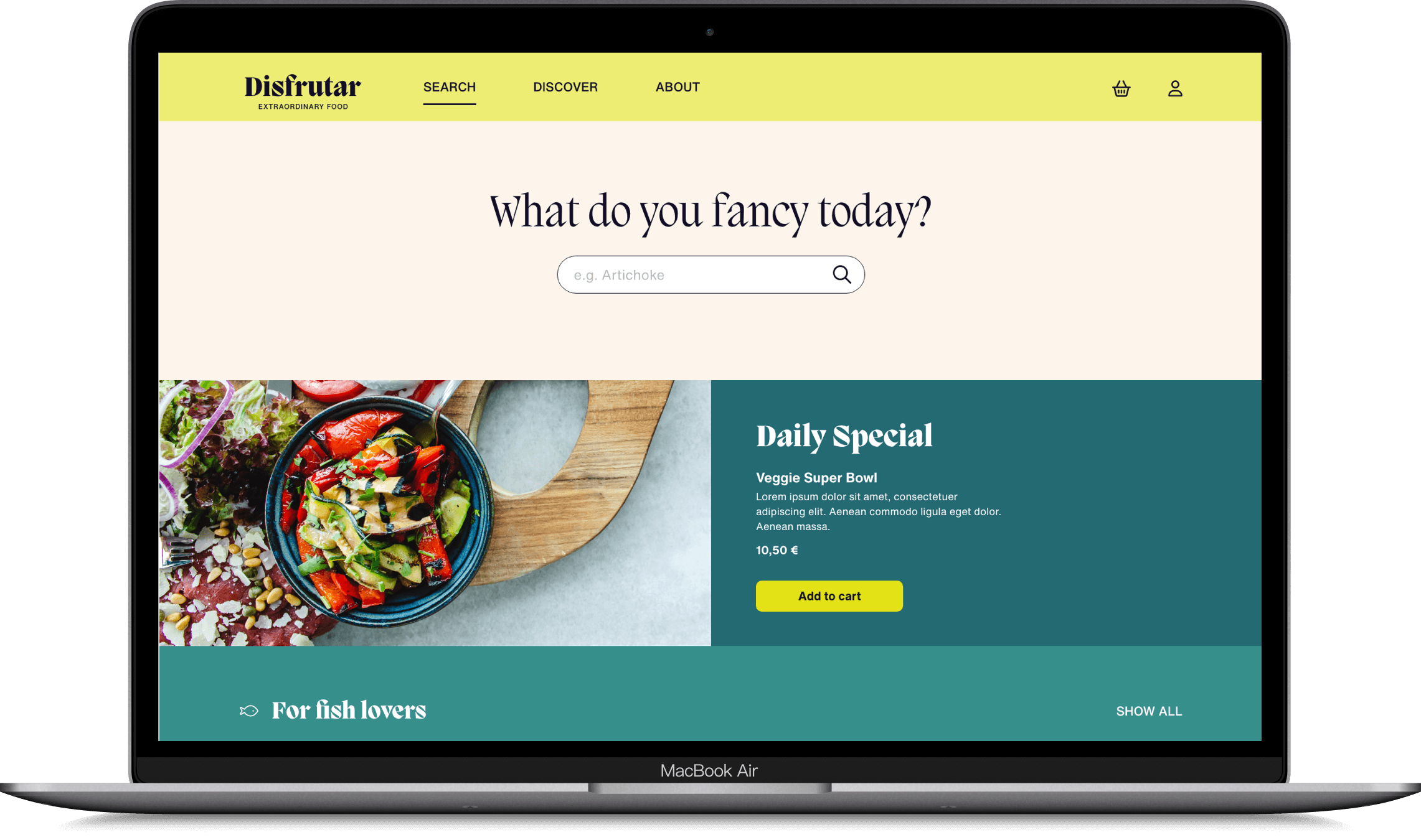
Based on the test findings, I iterated on the wireframes and created a high-fidelity prototype (see link below).
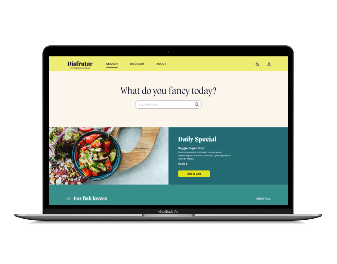
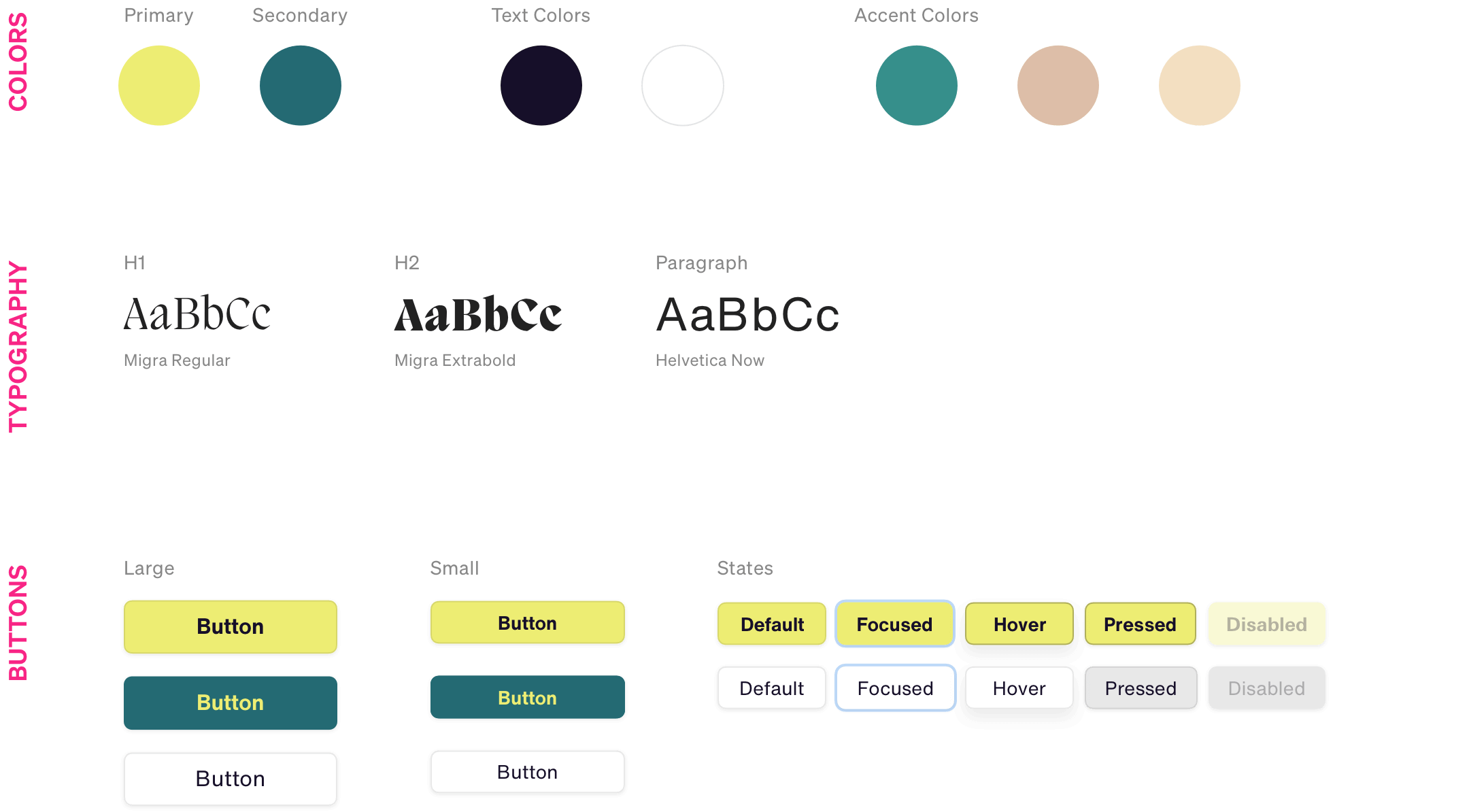
Styleguide
Utilizing a fresh palette of cool and warm colors perfectly fit the restaurant’s branding. The teal helps evoke a happy feeling in users, and paired with the yellow; it creates a nice balance between calm and energy. The primary typeface for the app is Migra. For body text, I used Helvetica Now, which beautifully complements Migra.
Accessibility Considerations
Color Contrast
I ensured that the contrast ratio is at least 4,5:1, which means AA status according to WCAG compliance.
Button Placement
Main CTAs are placed so that users can operate them with one hand.
Screen Reader
The app is screen reader-friendly. All images and videos have captions.
Takeaways
Research is essential as it builds the foundation for every decision made later in the project. Biases can influence user testing, and you have to overcome them. Also, accessibility and inclusion are essential, and many apps ignore this.
Studio